9 Dicembre 2013
English
Boston Public Library,
Machado and Silvetti Associates,
Honan-Allston Branch Allston, Massachussets, USA, 1998-2001
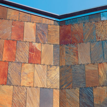
The new Boston Public Library Allston Branch is one of twenty-seven branches in the city’s library system. Differing from the main library, these local facilities provide an important outreach to Boston’s neighbourhoods, often serving as community centers in addition to their role housing books.
The library’s context is a heavily trafficked thoroughfare lined with triple-decker wood residences, one-story brick warehouses, and a few scattered commercial buildings, all typical of modest lower middle class urban neighbourhoods in America. The client also placed specific demands on the building chiefly that it follows a one-story configuration to maximize visual supervision on the inside and that the building have a separate entry for community functions spaces so that such locales will have complete flexibility and independence of use from the stricter library schedule.
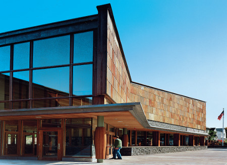
Foreshortened view of the main entrance of the library
Responding to these various conditions, the 20,000 square foot building’s part is divided into three parallel bands aligning with the main street – two “solid” zones and one central void. These correspond to the basic programmatic functions of the building. The front zone contains all the active, information-gathering program components, including the stacks. The rear zone contains all of the community meeting and program spaces, which have off-hours use. The middle zone is very transparent, with alternating gardens and glass pavilion reading rooms. By creating several small garden spaces rather than a single large court, each reading room is able to have a garden on two sides with differing characteristics.
During library off hours when community functions take place in the rear zone of the building, a secondary entrance is available without violating the security of the library. The central garden can be linked to those spaces on the back zone and act as an outdoor space expansion via two large doors that connect the contiguous spaces.
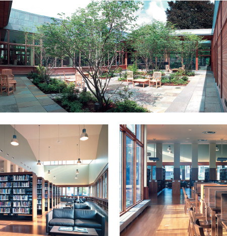
Views of the internal reading courtyard and of library interiors
On the front of the library, the periodicals reading room is treated as a double-height distinctive piece in order to establish a scale and material richness that are commensurate with the institution’s importance.
Yet its configuration is also appropriate to the neighbourhood, continuing the rhythms of the pitched roofs of the adjacent houses, for example, here reinterpreted in the butterfly form. Whereas the majority of the library recedes from the street edge with more subtle material and volumetric treatments, the reading room serves as the building’s public interface, formally addressing the street by projecting forward and by the density of its material palette. These perceptual devices allow the library’s significance to be represented by a relatively small volume, but one that establishes a strong presence and character for the library.
The front reading room’s form is further calibrated to the oblique approach by car. The inflections of its plan attenuate the volume when viewed from the quickly moving traffic. A continuous, deep canopy draws pedestrians inside.
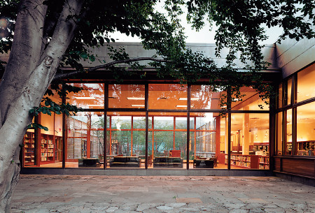
View of the courtyard-garden
Passing through the front entrance, patrons arrive at a vantage point where the organization of the entire library unfolds before them. They immediately discover the continuity of the larger volume that comprises several interrelated spaces: the book stacks, the pair of reading rooms, and most significantly, the three inner gardens. In particular, these last spaces perceptually unify the experience of the library’s patrons, since all functional activities are organized around them.
They occupy the heart of the building, bringing light and garden views to every part of the library.
The library’s material palette includes Norwegian Slate panels, Vermont Slate shingles and rough sculpings, unfinished Jarrah cladding and wood windows. These materials were chosen not only because they minimize maintenance demands, but also because they acquire a beautiful patina with age. On the interior, the casework is clear-finished African mahogany and the floors are a combination of hardwood, stone and cork that share the same warm tones of the exterior materials. (M. & S.)
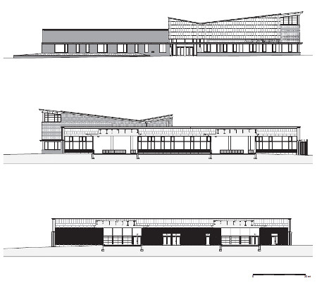
Façade on North Harvard Street and longitudinal sections on the reading gardens
Project Title:
Boston Public Library, Honan-Allston Branch
Project Address:
300 North Harvard Street, Allston, Massachusetts, USA
Design period:
1998-1999
Construction period:
2000-2001
Clients:
City of Boston, Public Facilities Department
Boston Public Library
Architects:
Machado and Silvetti Associates Inc.,
Boston, Massachusetts, USA
Project team:
Jorge Silvetti (Principal in charge), Rodolfo Machado
(Consulting Principal), Timothy Love (Project Director),
Matthew Oudens (Project Architect)
Design team:
Michael LeBlanc, Gregory Canarias
Building general contractor:
Peabody Construction Company Inc.,
Braintree, Massachusetts, USA
Stone materials employed:
Exteriors:
Norwegian “Black Lace” Slate, Vermont “Heathermoor”
Slate (wall cladding), “Natural Cleft Bluestone” (paving)
Interiors:
“Natural Cleft Bluestone” (paving)
Stone supplier:
Vermont Structural Slate Company, Fair Haven, Vermont, USA
Stone placement:
Target Masonry, Bridgewater, Massachusetts, USA
Taken from New surface aesthetics, by Vincenzo Pavan
