31 Maggio 2009
English
Mumok, Museum Moderner Kunst Stiftung Ludwig (1986-2001)
Ortner & Ortner *

The Ludwig Foundation Museum of Modern Art is part of an enormous cultural complex, the Museumsquartier, covering a total area of some 60,000 m² and situated in the baroque block that was formerly the Imperial Stables of Vienna. Of the original design by Fischler von Erlach (1716), only the 350 metre-long façade facing the Vienna Ring remains.
A competition was held in 1986 for the transformation of the entire Hofställgebude area of the city, and work on the new Museum Quarter was completed in 2001: this new architectural complex currently comprises the Leopold Museum, the MuMok and the Kunsthalle, while the remaining historical buildings were transformed to accommodate the ZOOM Kindermuseum, the Architektur Zentrum Wien, Quartier 21 (space for a series of art workshops), together with a centre of contemporary dance and performing arts, artists’ apartments, restaurants and bars. Ortner & Ortner have successfully blended this multidisciplinary artistic area of Vienna into the complex urban surrounds (which the architects took as their model when creating the structural design of the Museum Quarter).
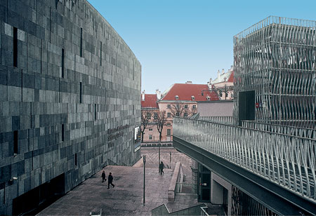
The MuMok is a recently built volume possessing its own individual character, although it has been designed to blend in well with the existing surrounds. Its rotational experimental layout differs considerably from the imperial design of the Leopold Museum – with its specular buildings designed in the 19th century by Gottfried Semper – and from that of the Maria-Theresen-Platz and of the Art and Natural History Museum: the MuMok is oriented in relation to the urban fabric of Neubau – a residential quarter linked to the MuMok both physically (via walkways) and symbolically (in terms of the industrial culture it represents).
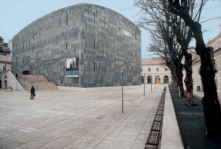
Inside the courtyard, the two volumes – one dark, the other light –stand out from the urban context and are presented in a random position, free of the baroque order, thus creating a stimulating area of diversity. They remain of a classical style: that is, they are complete, proportionate volumes, and the objective sense of the finished product is emphasised by its specific design and the building materials used.

The parallelepiped volume of the MuMok has the appearance of a casket perforated by a limited number of openings. Laid out over an area of 30×50 metres, the upper section of the building terminates in a kind of sail-dome supported by a ribbed floor; the lower section is “sunk” into the ground, separated from the courtyard surface.
The stone cladding enveloping the building forms a continuous layer: both walls and roof are one continuum, and the corners have been rounded to variable degrees (ranging from a radius of 30 cm to those that disappear at the top of the building, merging into the domed surfaces of the roofing.
Ortner & Ortner’s MuMok is a work that marks a clear departure from the ordinary language of architectonic design, thus depriving us of a clear idea of its dimensional scale, sealing the internal section and the spatial layout with solid, inscrutable façades. This apparent lack of communication is counterbalanced, however, by the graphic design of the cladding itself, aided by the potential of digital aesthetics; the result is the accurately controlled “randomness” (based on precise mathematical calculations) of the cladding pattern, interrupted very occasionally by small slits and window openings, joints and slight colour differences.
The museum entrance has been created by moving the façade back a distance, while the only exception in the entire composition is a window flush to the wall, through which people standing inside the exhibition space can see out across the Kaiserforum. The load-bearing framework of the building consists of a series of reinforced concrete walls that divide the volume into different floors and spaces: the exhibition halls – neutral, flexible spaces; two lateral corridors; and a high-ceilinged scenographic area, clad in basaltic stone next to cast-iron and tempered-glass surfaces.

[photogallery]ortner_album[/photogallery]
The surfaces of the external façades – made up of slabs of 10 cm.-thick basalt (obtained using a diamond-tipped saw blade) – are porous and slightly shiny, and their bright anthracite colour turns dark black when the walls are wet.
The pattern of the cladding arrangement is given by the superimposition of different layers of stone: the horizontal bands increase in size as you move up the façade, while the vertical joints between the slabs (left open to create a chiaroscuro, engraved effect) are of two sizes and depths (10 mm. and 70 mm.), and together with the windows and slits in the facing they are arranged in a mathematically-calculated sequence so as never to correspond in adjacent courses of slabs. The overall effect is the fascinating characterization of the various stone façades, with their chiaroscuro vertical markings.
This refined, digitally-produced “watermark” is given by the system by which the individual elements of cladding, and the subsequent layer, are mounted: the slabs of lava stone (of the same size but of different hues) are laid side by side within each row, giving the surface an extremely vibrant, chiaroscuro appearance, almost like a series of mega-pixels. The result is a pleasant dynamic effect that adds character to the design of this house of art, this “intelligent storeroom” in the words of Ortner & Ortner.
Gabriele Lelli
* The re-edited essay has been taken out from the volume by Alfonso Acocella, Stone architecture. Ancient and modern constructive skills, Milano, Skira-Lucense, 2006, pp. 624.
