26 Marzo 2009
English
The Leibnizkolonnaden in Berlin (1997-2000)
Designed by Hans Kollhoff *

Just a short distance from Berlin’s Kurfürstendamm, Hans Kollhoff, aided by Helga Timmermann, has created a truly rigorous work of architecture that has conferred a strong identity on what had previously been an empty, substantially forlorn urban space.
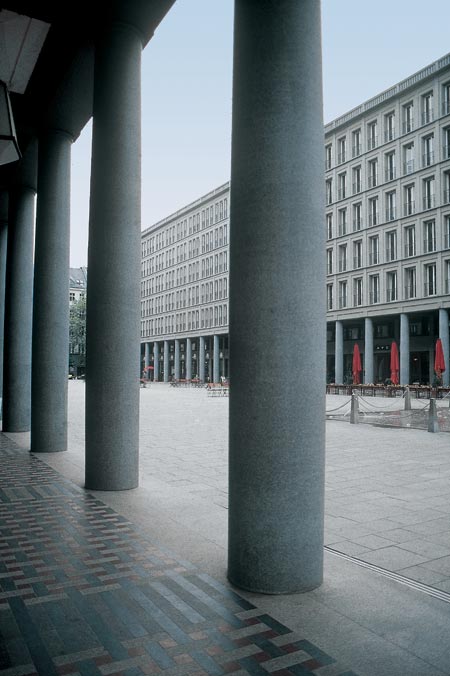
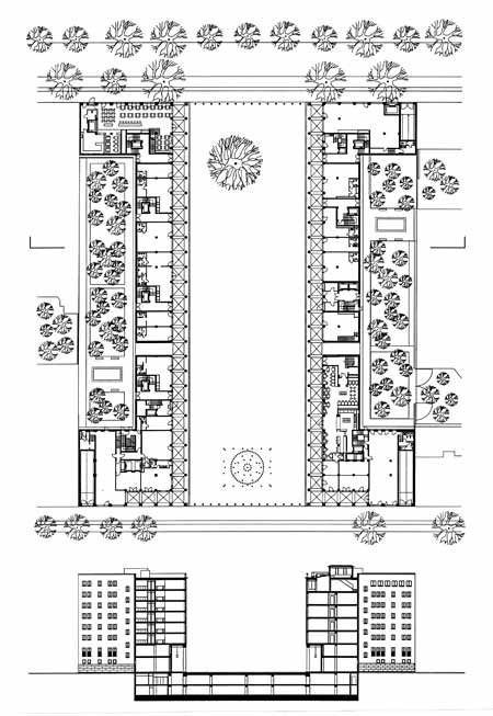
Kollhoff’s two compact structures have clearly defined two sides of a new square, which they separate from the exisiting buildings on either side. This square, named the Walter Benjamin Platz, forms a wide pedestrian zone joining two of the major roads in the Charlottenburg quarter of the city. On the Leibnizstrasse side of the square, a series of fountains arising out of the granite-slabs of the concourse drown out the noise of passing traffic. The walls of this newly-created space are constituted by the continuous façades of the two opposite buildings, some 100 metres long and 20 metres tall, creating a lengthy vista.
Each of the two buildings incorporates a variety of spaces with either commercial, residential or entertainment functions, and each consists of a different number of floors (seven or eight), layout and structural arrangement (frames or seven reinforced concrete load-bearing structures). This differentiation gives rise to two symmetric, yet not identical, façades, whose structural scansion of perspectives often varies, although it always remains within a commonly-shared framework dictated by the continuous eaves (surmounted by a low attic) and by two identical, ground-floor colonnaded porticoes.

The columns, which constitute a kind of gigantic order rising the height of the first two floors of each building, contribute to the static design of the whole, and together with the lesenes and strings on the upper floors, they stress the plastic thickness of the façades. The division of the façade has a strong chiaroscuro character, created by the great monolithic columns and the large grey, sandstone facing slabs positioned in a layered pattern. In the words of Kollhoff himself: “we no longer build with heavy, roughly-hewn stone. The stone we use comes in slabs three to six centimetres thick (…). The arrangement of these slabs on the façade may be based on either of two opposing principles. The first is to consider the building as an abstract cube (…). The second is to treat the building in an objective manner: the slabs have to be arranged according to a structural principle (…). Following a structural process, besides the long-forgotten forms of expression, other possibilities emerge which go beyond the mere question of distribution of weight, and focus on the relationship with Man’s physical presence. This is why we suggest – above all in the square, where the building is no longer a volume but simply a surface – that when the façade is built, the covering be layered, thus working towards a raised effect. The facing slabs can be applied in a layered fashion, one behind the other, without any problem. The gaps get covered and the joints are only visible in the vicinity of the architrave. A subliminal architectural form gives a monolithic impression and offers that play of light and shadow that is so impressive before the stone is hewn”. 1
From this point of view, whereby the massive nature of the stone architecture is not “falsified” but updated in terms of its constructive “substance”, the monolithic appearance of the columns is also achieved thanks to a fruitful syncretism, a blend of reinforced concrete technology and the renewed practice of stone cutting.
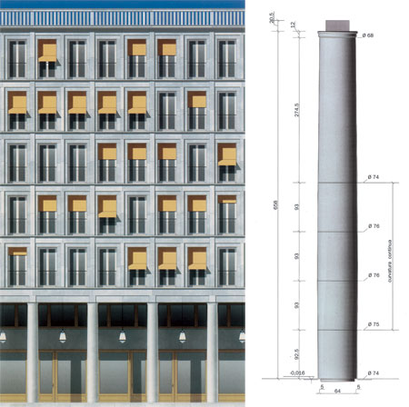
A mixture of binders and marble grit is poured over a steel frame and inside a metal caisson, thus casting the shafts of the columns. The rough elements thus obtained are then worked on a large lathe to give them the perfect geometrical entasis that characterises the finished column. In a constructive process that sees the stone-mason’s skills replaced by the electronic precision of numerically-controlled machines, the shafts are further sanded and polished to give them a mirror-like finish that highlights the homogeneous granules of marble grit in the mixture.

[photogallery]kollhoff_berlino_album[/photogallery]
For Kollhoff, this series of 52 identical shafts, more than 6 metres high and with a maximum diameter of 76 centimetres, represents the quintessence of the contemporary column; a column with no base, given that it stands directly on a stone platform – one that evokes the classical stylobate – and with no capital, ending as it does in a simple annulet. In this extreme synthesis of the new forms of a stylised architectural order, the classical entablature sequence of architrave, frieze and cornice is also present in a reduced form, consisting of a simple, slightly projecting combination of two flat bands and a crowning listel. The ancient triglyph is evoked in a square plate positioned along the axis of each column.
Notes
* The re-edited essay has been taken out from the volume by Alfonso Acocella, Stone architecture. Ancient and modern constructive skills, Milano, Skira-Lucense, 2006, pp. 624.
1 Hans Kollhoff, “Hofgarten am Gendarmenmarkt, Friedrichstrasse 79”, in Bauwelt no.7, 1997, p.300
