27 Dicembre 2007
English
The Chancellor’s Block at the Universidade Nova in Lisbon (1998-1999)
Manuel and Francisco Aires Mateus*

Two specific features make the Aires Mateus brothers’ creation an exemplary one: the first is the urban value of this remarkable work, considering the potentially problematic historical setting of the neighbouring Jesuit College and Monsanto Park; the second is its institutional role within the city.
Moreover, there is also the innovative nature of the work in itself. The volumes in someway resemble the sculptures of the Basque artist, Chillida, in that the incisions cut into the solid object lend equal importance to both empty spaces and the material that contains these spaces. The architectonic volumes are clearly defined and solid, but at the same time ambivalent, for if we view them from particular angles, they resemble “thin sheets” positioned to envelope space, or appear open to the outside through narrow slits. This general framework also includes the use made of stone – the only material left in view, so as to lend character to this public space within the city.
A careful examination of the work reveals the underlying conceptual principle to be the continuity of those surfaces that generate the work from the urban and architectural points of view.
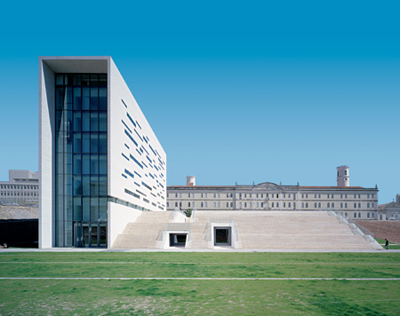
The Chancellor’s Block is a single, L-shaped volume with a constant width of eleven metres: the vertical side reaches up to the same height as the guttering of the adjacent Jesuit College, while its short side forms the horizontal basement platform at ground level. The two sides form a clear right-angle, which in turn redefines the existing spaces and their relationship with the building’s urban surrounds. The Block consists of a single volume clad in light-coloured stone. The elementary, sculptural form set into the slope renders the new university building part of the surrounding urban fabric.
The vertical volume hosts the offices, while the horizontal plateau structure – the roof of which constitutes the new square, while its façade consists of the monumental staircase – contains the entrances, the foyer, the meeting rooms and conference halls. In order to maintain spatial continuity between the two parts of the building, a hinge-like, full-height space linked to the foyer on the ground floor has been created.
Once inside the building, it is thrilling to walk across the large space that suddenly curves, changes direction and grows higher, up towards the light that spectacularly descends from the top of the vertical body of the building. On the outside, the harmonising tone renders the vertical volume lighter and more majestic, linking it permanently to the horizontal body; when viewed head on from the square, the three-dimensional solid is transformed into a series of two-dimensional surfaces (in truth, 45 cm. thick) furthered by the design of the horizontally-laid stone cladding. In metaphorical terms, a single curved sheet anchored to the blind side of the staircase, rises up vertically to the roof and then down again the other side (animated by the chiaroscuro of the wall openings) to ground floor level, and then continues at ground level to pave the square. In this way, the curved sheet, seen from the side, appears as a line, and thus renders the front of the staircase permeable and open: the “empty space” of the glassed loggia (letting in the light) on one side, the “plinthed” staircase of the square on the other.
The geometrical accuracy of the volumes, and the empty-full effects they produce, give the university complex a solid, unified appearance.
The stone surface of the cladding, consisting of 3 cm.-thick slabs, is the result of a fabric-like design (resembling that of certain stone paving) consisting of horizontal courses of various height and staggered vertical joints. The master stroke of this work consists in the openings, in the form of slits, cut into the surface of the emerging volume; the horizontal slits, from one side to another, in interrupting the stone plane, dictate both the figurative and the functional relationship between the wall, the basement and the square.
At the same time, in keeping with the continuity of the surfaces, the office windows facing out onto the square have been created by taking out a number of courses of stone and replacing them with sheets of glass mounted flush to the wall. This free façade reveals no reference to the load-bearing structures, which have been skilfully concealed in the background, thus giving the wall composition a design strongly influenced by “dark marks” of various thickness which, engraved into the material, spread out in a horizontal direction across the façade, with no hint of verticality. The variously-sized openings seem to belong to the stratification of the stone cladding, each positioned in an apparently random fashion, independent of the next. Behind the flush glass surfaces – that guarantee the continuity of the wall – the windows’ intradoses are of dark metal, and as such are an integral part of the set-back window frame. In this way, the layer of stone loses all thickness, and becomes an example of “pure decoration” – a positive symbol of the project as a whole.
Gabriele Lelli
* The re-edited essay has been taken out from the volume by Alfonso Acocella, Stone architecture. Ancient and modern constructive skills, Milano, Skira-Lucense, 2006, pp. 624.
