25 Maggio 2009
English
Monochrome
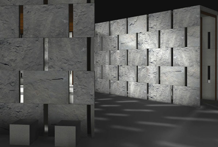
Monochrome pavilion projected by VISTO Architectural Workshop.
Synergetic efforts of a group of companies involved in a common exhibit design project created Monochrome, a space for cultural exhibitions for the next editions of ‘Abitare il Tempo’ and ‘Marmomacc’ in Verona; in this setting Firenzuola’s Serena stone will give life to a rustic involucre conceived to comprehend a collection of stone elements for the bathroom furnishing. Plates of the Tuscan sandstone, selected in the quarry platform and implanted without further manufacturing, will confer to the micro-architecture the aspect of a rock casket aimed to restore the primitive facies of the stone material; the design elements, entirely realized in Serena stone, will interpret the lithotype in a refined and heavily conceptual way.
Monochrome is conceived by VISTO Architectural Workshop and will contain Saturnia collection designed by Philippe Nigro for PIBA Marmi. The manufacturing of the space will be possible thanks to the strategic collaboration of the complementary productive realities that have commissioned the project: Il Casone will provide and manufacture Serena stone, extracted and selected in its own quarries; PIBA Marmi will be involved in the monochromatic declination of the collection of bathroom elements that will be exposed in its inside; Fischer and Fila will intervene in the phases of engineering and execution of fixing and superficial finishing processes of the stone; Viabizzuno, in conclusion, will sign the technical project of the pavilion illumination.
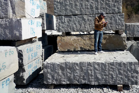
Serana stone blocks in a quarry in Firenzuola.
Monochrome’s involucre will be substained by a light metallic framework on which a covering composed by stone modules of homogenic formats (100×70 cm) and variable deepth (6 to 8 cm) will be fixed. The plates will be obtained from the “barks” of Serena stone blocks, that is to say from the external surfaces of tridimensional elements usually discarded at the beginning of the traditional process of transformation of the Tuscan sandstone. The surfaces maintain the signs of numerous perforations and manufacturing procedures, necessary to separate the stone material from the mine front and to obtain the first quadrature of the blocks; they will create a rough and vibrant covering surface, monochromatic but at the same time rich in nuances and chiaroscuro effects activated by the razing light.
The stone covering will also line the interior space, on the floor and on the walls where the stone will show to the visitor the same rough and naturalistic aspect of the outside or a more formal look: in some sectors of the walls, in fact, the involucres will be visible through the thin support structure in the form of smooth surfaces on the same plane, because the inner faces of the plates will be rectified by a simple cut finishing.
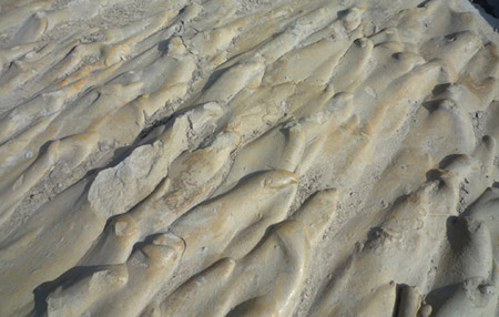
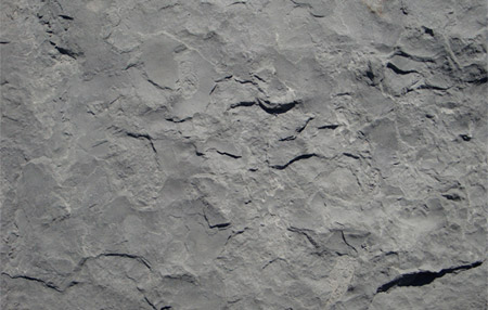
Rustic surfaces of some plates in Serena stone.
Philippe Nigro’s new collection, Saturnia, will be exhibited in this fixed scene, characterized by the total design in Serena stone, where the designer explores the variations of compenetrated geometries, that can be interpreted as unusual metaphors of the contemporary need for an integration between peoples and cultures and translated in a particular transfiguration of the diagrammatic theory about mathematical sets, composed by compact and net stone figures.
In this rustic involucres of the covering, and also in its refined core in the inside, the definite chromatic leaden dominant of the pavilion will be fractioned in several nuances of dark and light greys, typical of the mineral structure of Serena stone, and will be enriched by vivid argent-like, blue or dust-coloured variations, by yellow veins or brown fades, bright introductions of micas or subtle inclusions of white calcites; the last, in its turn, will interact with the always changeable superficial textures of the plates, signed by tracks, more or less smooth grains, more or less deep ridges.
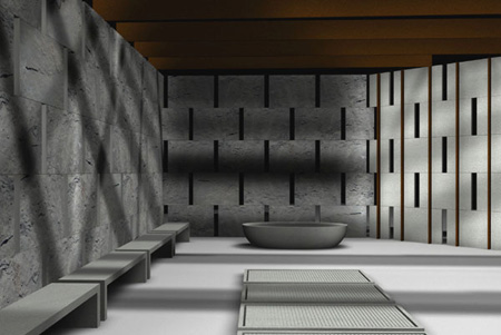
Interior view of Monochrome pavilion.
In this way Monochrome will affirm the true nature of the grey, not at all a colour neuter and without characteristics, but rich in relational and emphatic qualities connected to light and the other colours and, above all, in fascinating symbolical meanings; as Michel Pastoureau recalls, for instance, in his observations on the cultural and anthropological history of the polychromatic universe, grey has all the characteristics of a true colour and owns a double symbolism: «For us it can often remind the idea of sadness and old age; but when old age wasn’t such a disfavoured period of life, it was connected in the contrary to wisdom, experience, knowledge. It has maintained this connection with intelligence (the “grey matter”). At the end of the Middle Age, it was opposed to black, so being symbol of hope and happiness. Charles d’Orléans wrote even a poem entitled “Grey of hope”.
(…) Grey has a particolar status. Goethe has noted this singularity. According to him, the colour that reunites all the others isn’t white, a weak tint that contains very few chromatic materials, in his opinion, but grey which he defined “middle” colour: an observation that, in a chemical point of view, isn’t silly at all. In addiction (…) grey is the richest colour to work with: it owns lot of nuances, authorizes the most delicate monochromes, and exalts all the other colours».1
di Davide Turrini
Go to:
Philippe Nigro
Il Casone
Fila
Fischer
Piba Marmi
Viabizzuno
Note
1 Michel Pastoreau, Dominique Simonnet, Il piccolo libro dei colori, Firenze, Ponte alle Grazie, 2006, p. 100, (I ed. francese, 2005)
